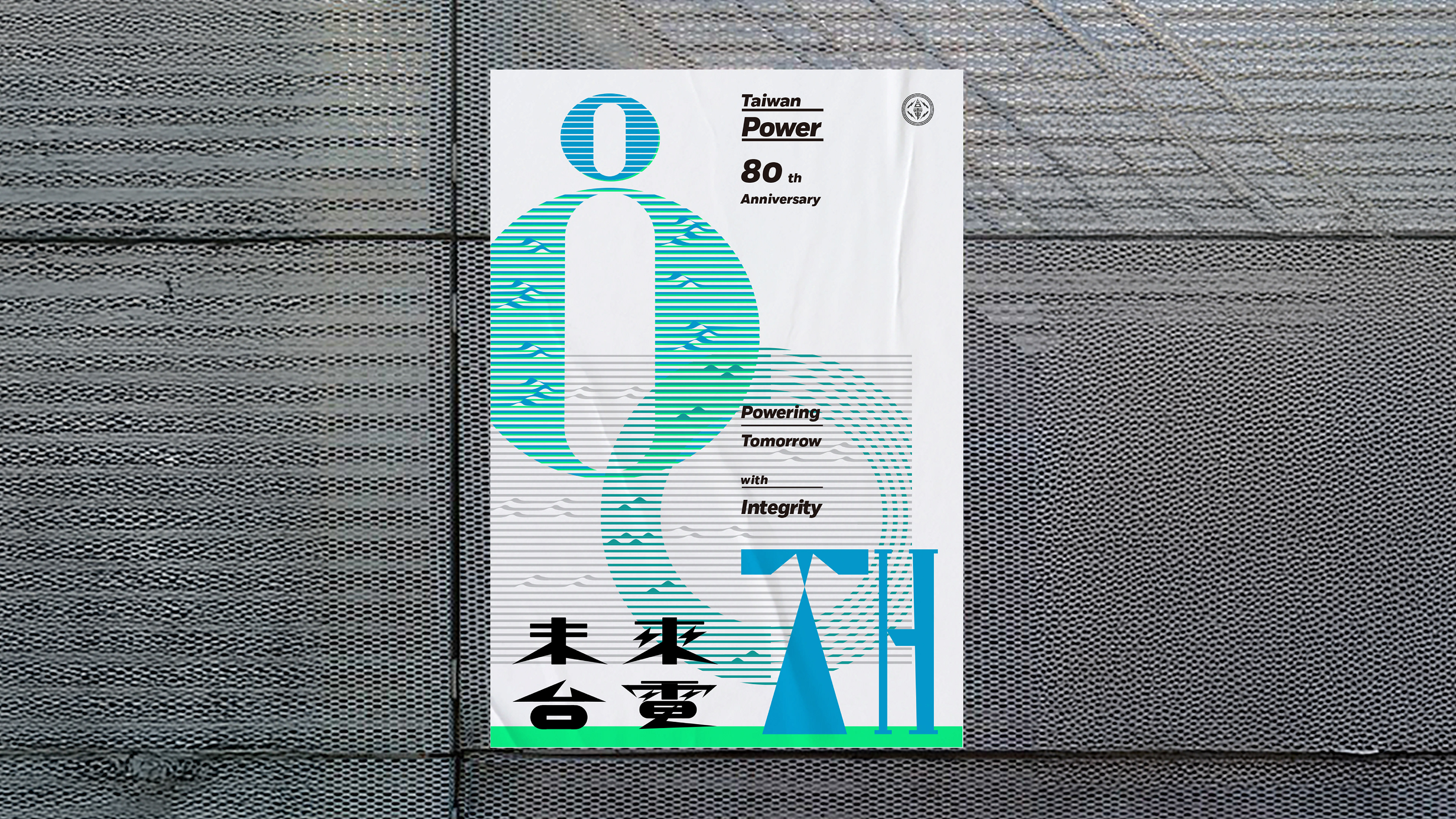
台電80週年|視覺識別設計
台電邁入80週年,數十年來日夜不懈運轉,支撐台灣島嶼上的民生所需與多元生活樣貌,將穩定的電力送往各個角落。
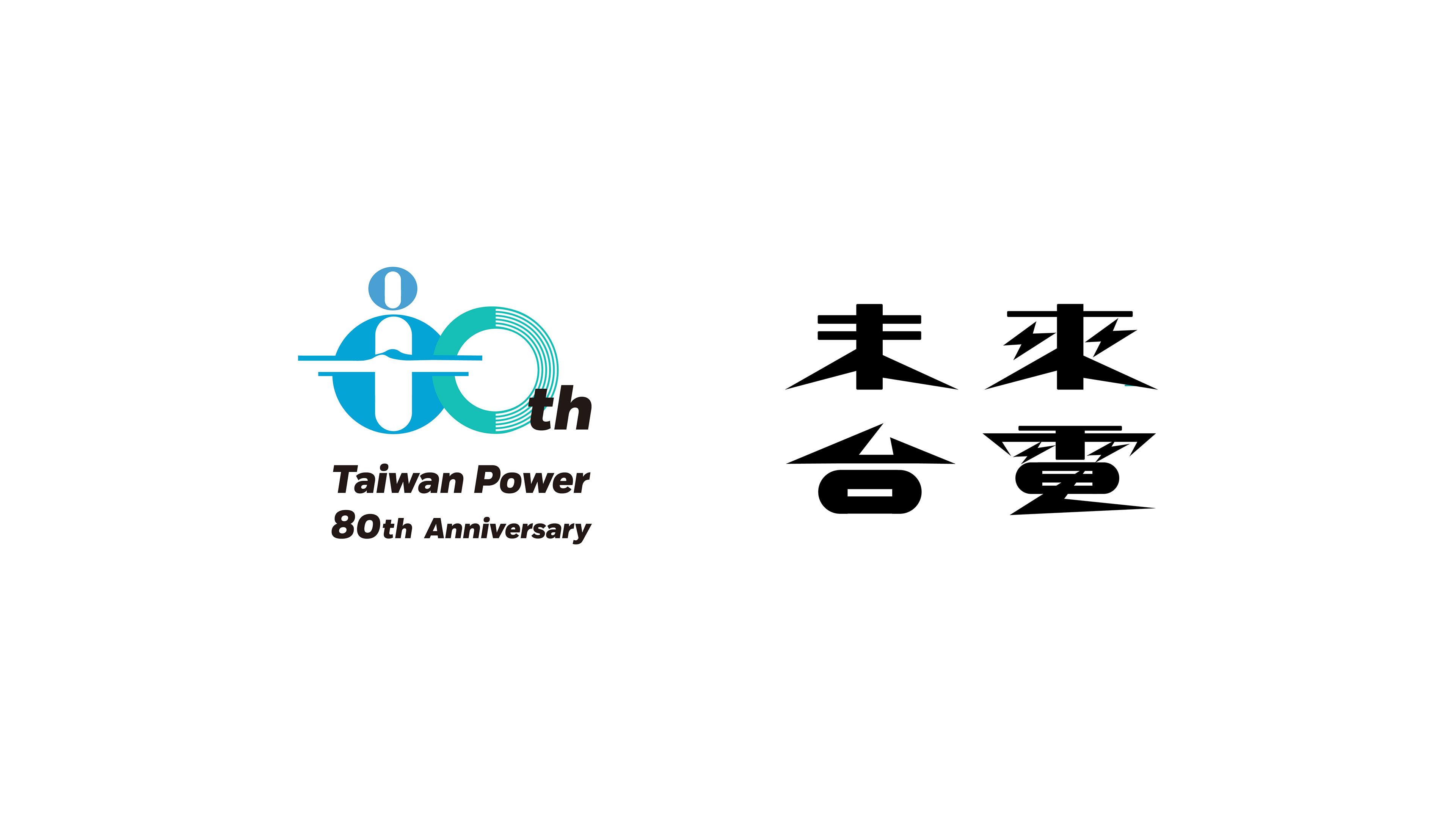
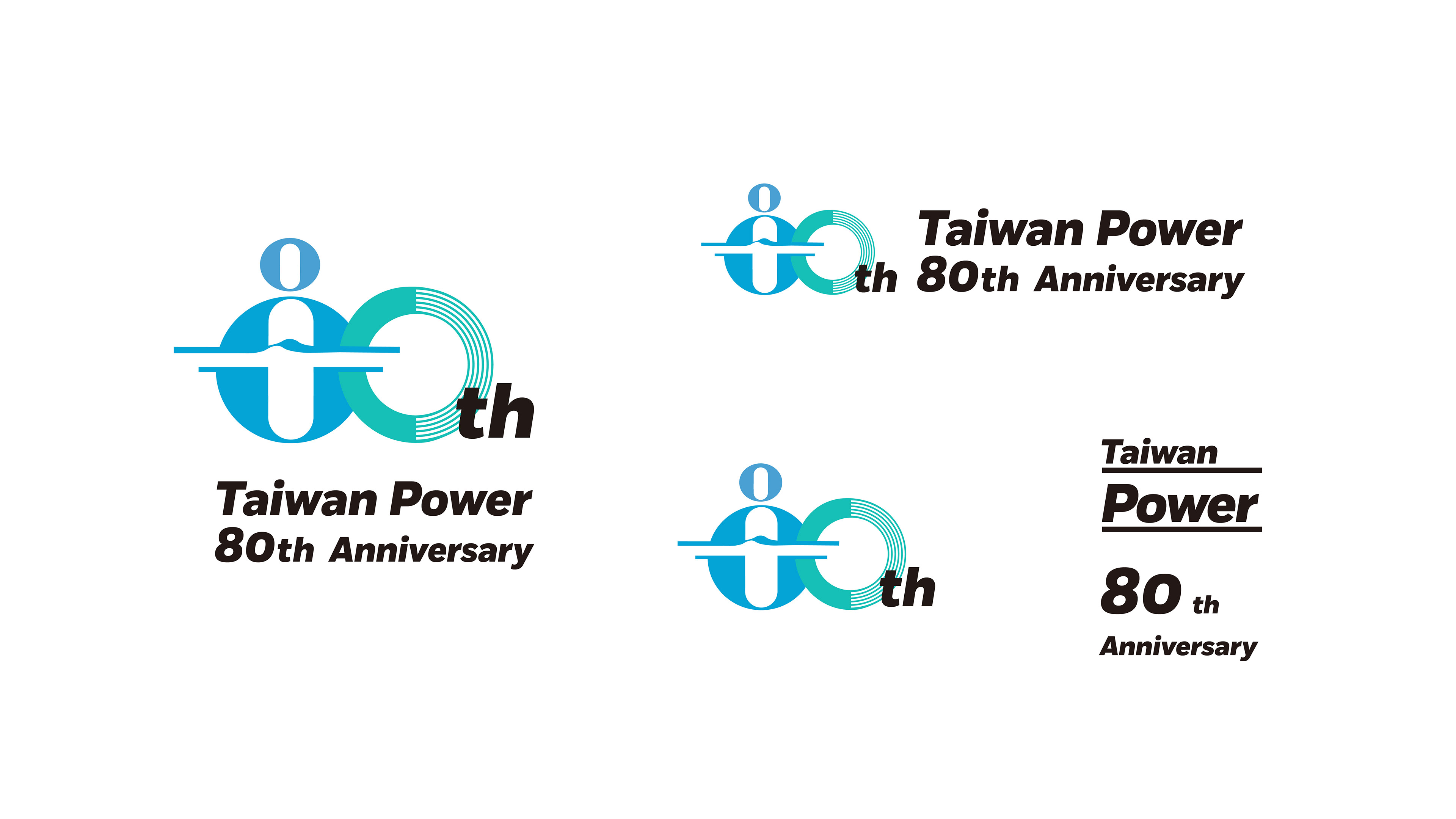
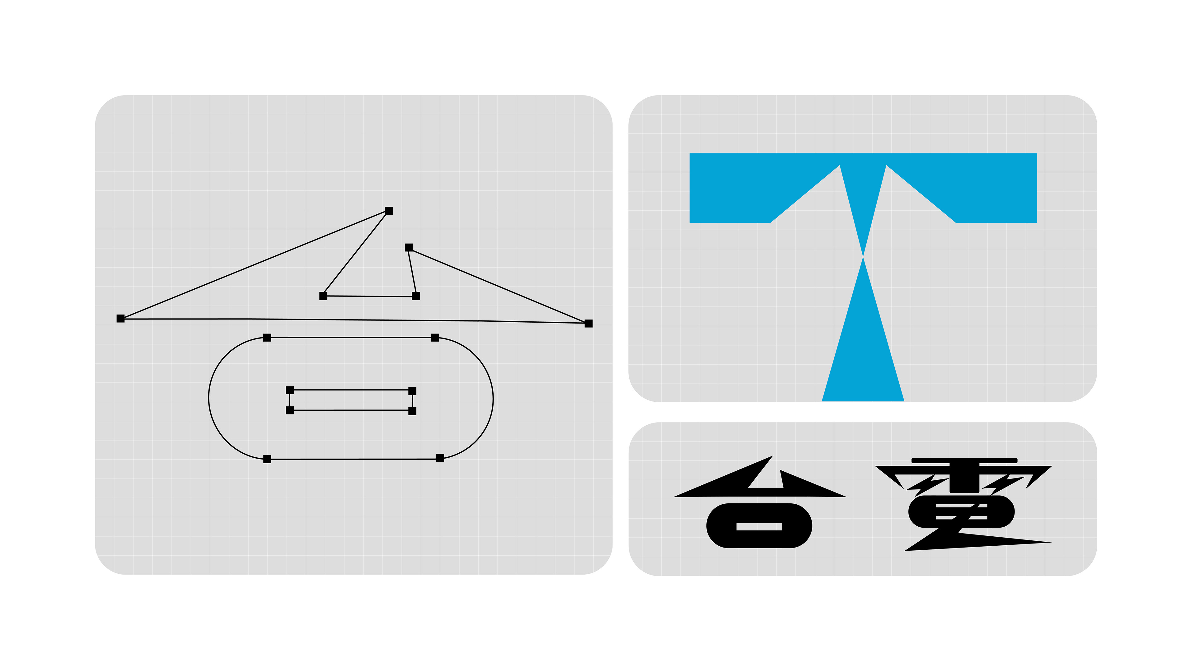
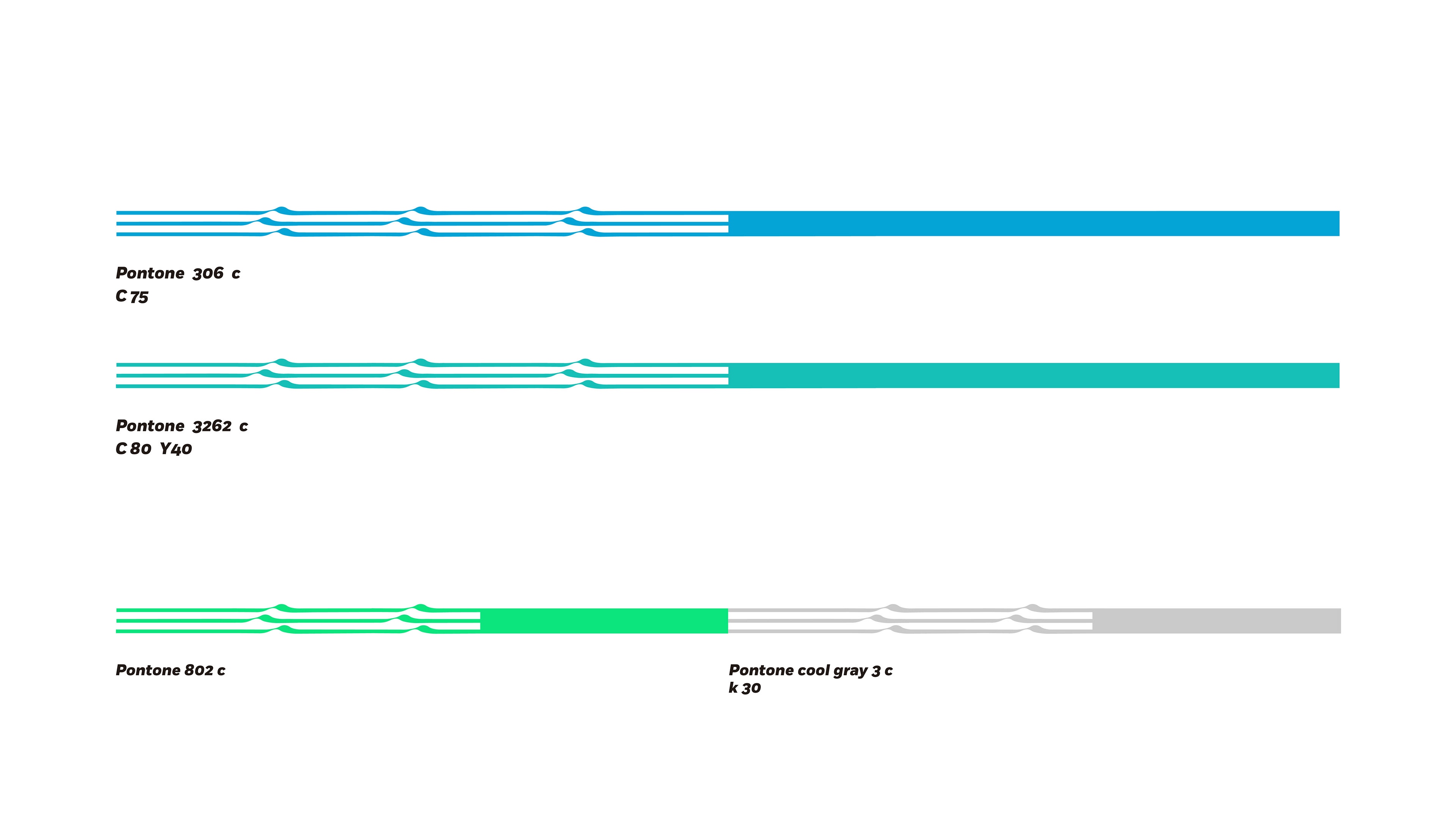
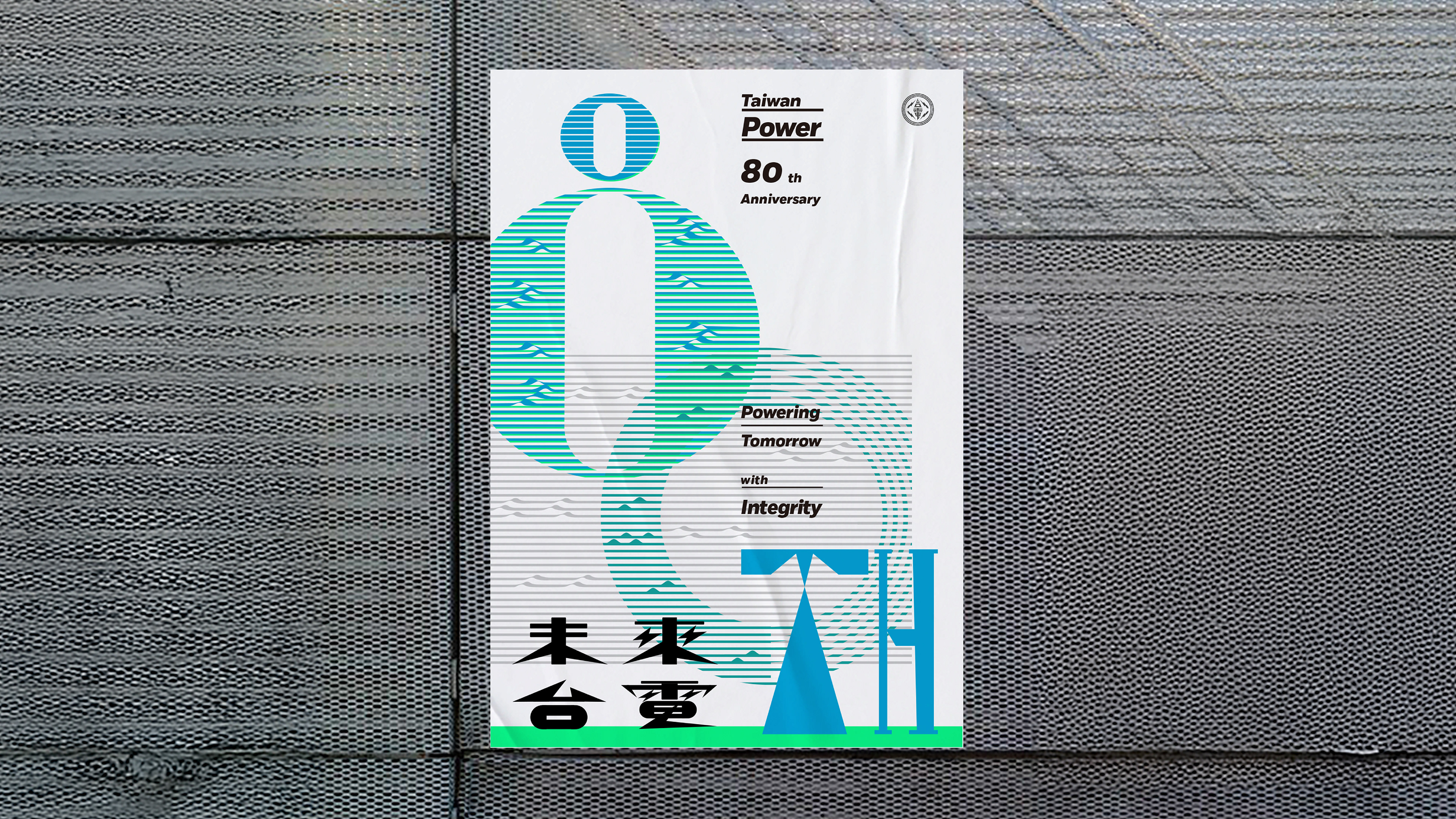
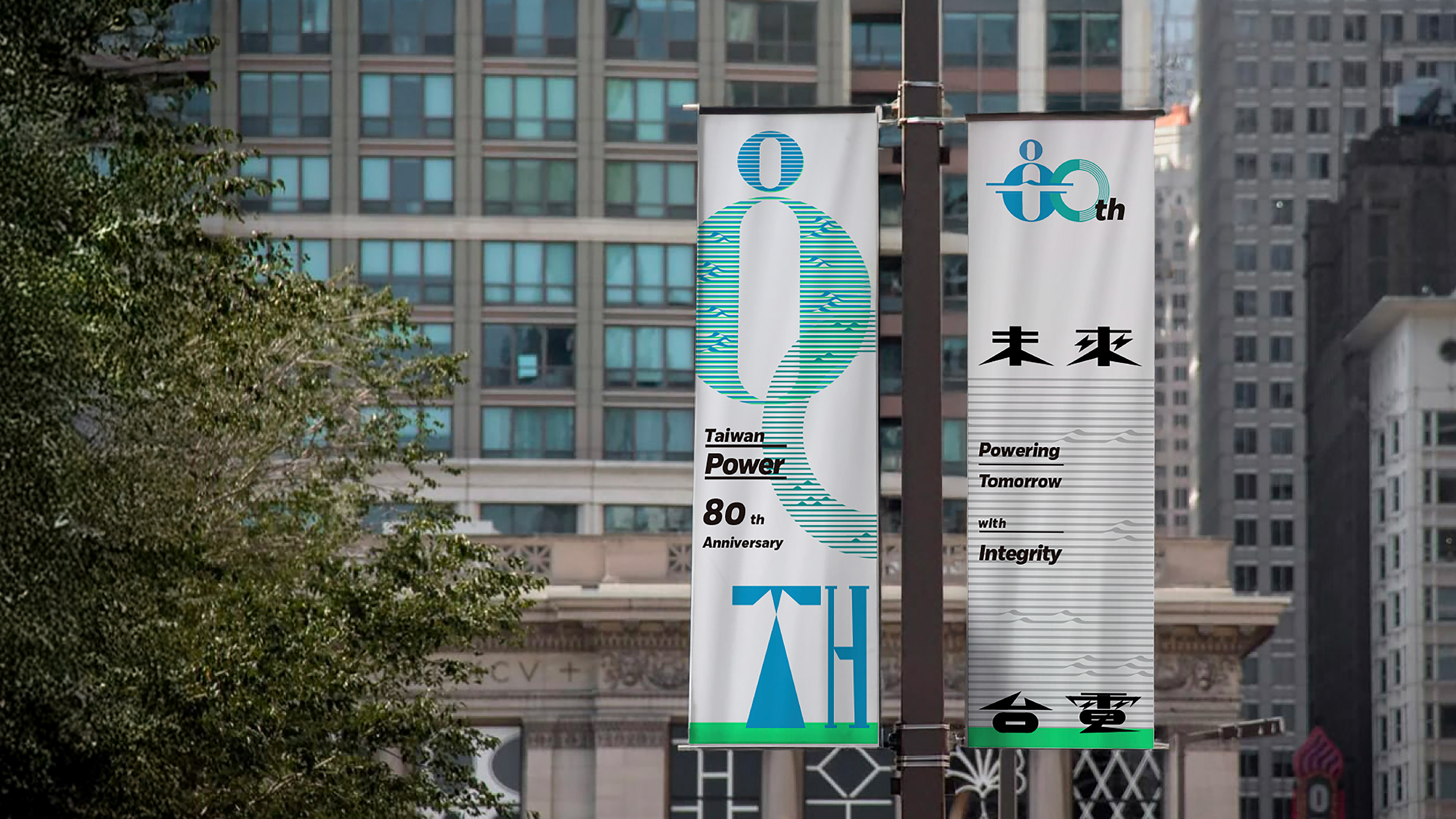
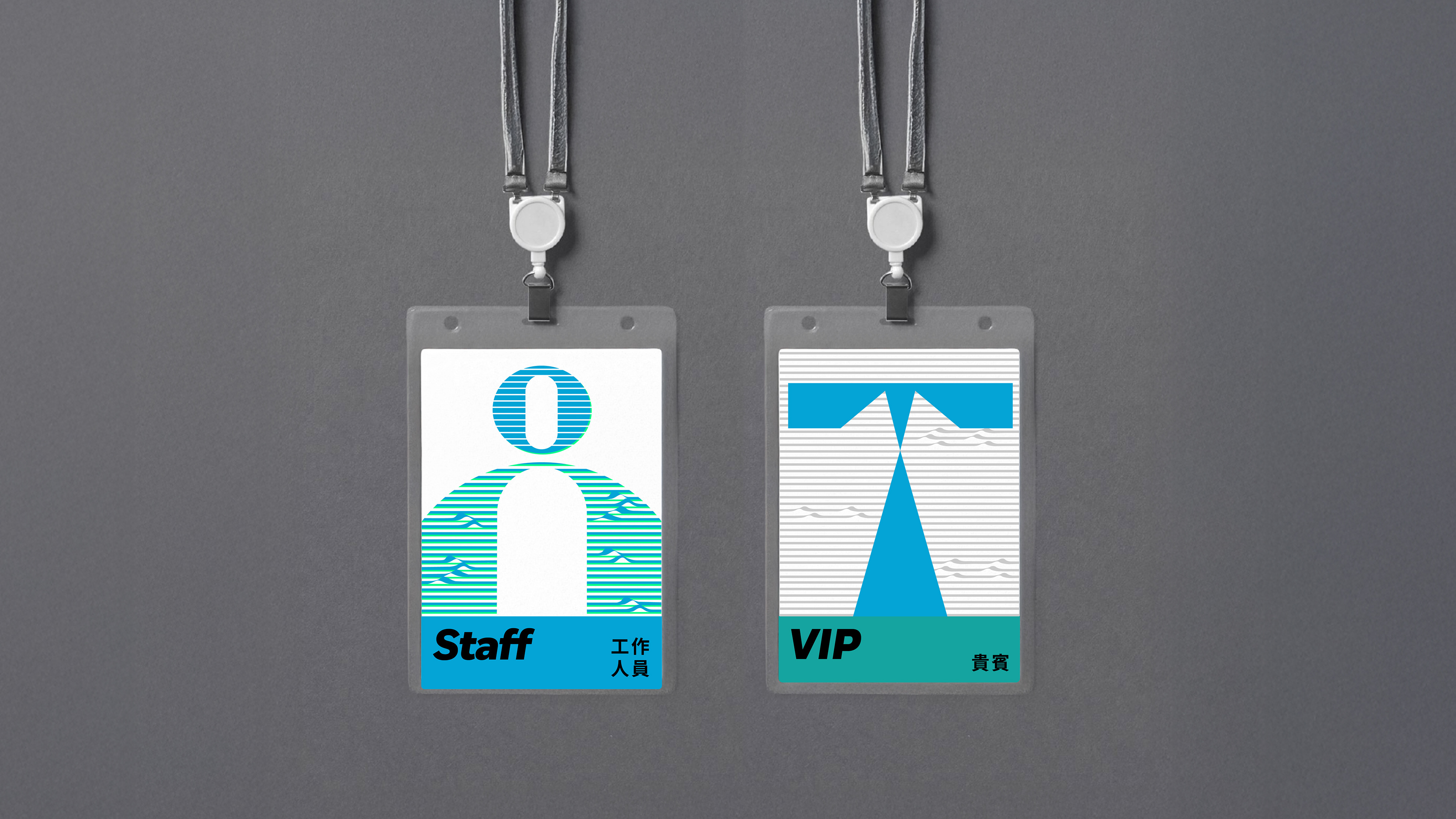
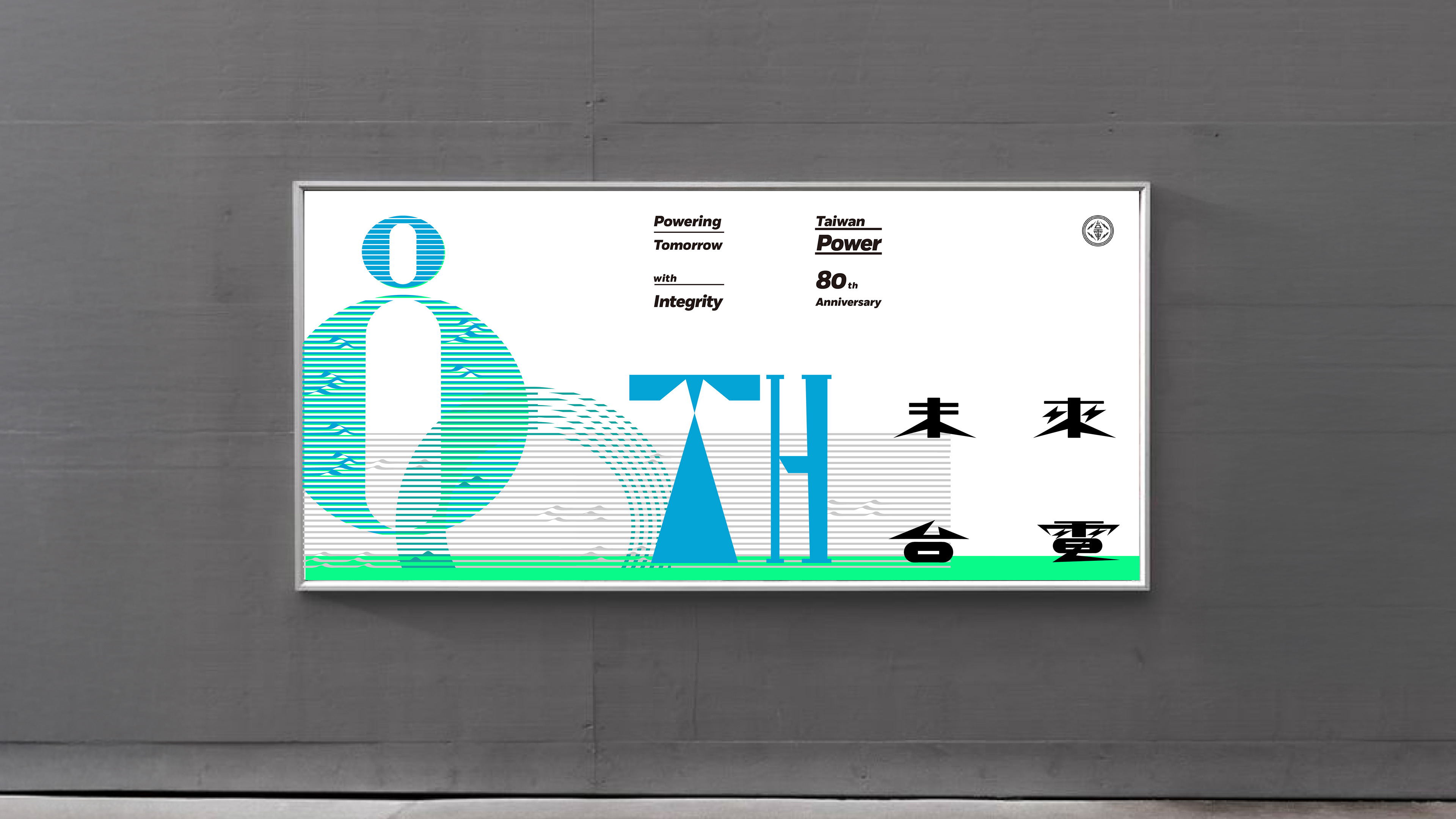
80週年視覺識別以「電力與地景」出發,將電網的延展結合島嶼紋理,並以文字設計中的 80th 作為視覺核心,形塑更具未來感與國際視野的識別語彙。同時,透過整體識別系統,傳達台電邁向更輕盈、永續,並以綠色電力為導向的未來發展方向。
80週年視覺識別以「電力與地景」出發,將電網的延展結合島嶼紋理,並以文字設計中的 80th 作為視覺核心,形塑更具未來感與國際視野的識別語彙。同時,透過整體識別系統,傳達台電邁向更輕盈、永續,並以綠色電力為導向的未來發展方向。
Taipower 80th Anniversary|Visual Identity Design
Marking its 80th anniversary, Taipower has operated relentlessly for decades, supporting everyday life across the island of Taiwan and delivering stable electricity to every corner.
The 80th anniversary visual identity is developed around the concept of “Electricity and Landscape,” translating the extension of power grids into island-like textures. With “80th” as the visual focal point in the typographic design, the identity projects a more future-oriented and internationally aligned expression. Through this system, Taipower’s vision of a lighter, more sustainable future—driven by green energy—is clearly communicated.
The 80th anniversary visual identity is developed around the concept of “Electricity and Landscape,” translating the extension of power grids into island-like textures. With “80th” as the visual focal point in the typographic design, the identity projects a more future-oriented and internationally aligned expression. Through this system, Taipower’s vision of a lighter, more sustainable future—driven by green energy—is clearly communicated.